Thursday, 27 January 2011
Monday, 17 January 2011
Preliminary task
 |
| This is my finished school magazine cover |
 |
| This is the draft for my contents page for my school magazine |
 |
| This is a professional magazine contents page, that looks good because of the layout colour scheme and the font, the coloyur scheme is pink black and white, the pictures make the cover look like it is professional becasue there isnt too many and there isnt too much. |
 |
| This contents page is not from a professional magazine, but it does have a clear colour scheme consisting of red, black and white. The way it is layed out looks quite professional and the pictures with the numbers in them also adds to the professional look of the contents page.The font and the titles also make the magazine look better quality and something that has been made by professionals |
 |
| This is a contents page from an un professional magazine and you can see that it has a colour scheme of black white and yellow, the yellow coloured numbers are the same colour as the lights in the picture at the top making it look more professional, and the colour scheme and font also help the look. |

 |
| This was the photo i took for the front cover of my school magazine, which i manipulated to remove all of the background and all other things to make it look more professional and make it so i can change the background colour on the magazine. |
 |
| This magazine has a colour scheme of green, pink and white, it looks like a good magazine that you would see in shops, the bright green title makes you focus on that as does the the photograph because it stands out from the bright white background. The cover lines all stand out by being in the colour scheme and most of teh other writing is white. |
 |
| This cover has a dark theme with white writing making the mast head stand out and the picture look calm and relaxed. It has a good colour scheme which is white yellow and black, the title is the opposite colour from the picture to make it stand out and be noticable. The cover lines dont really stand out making all of the focus on the picture, the mast head and the main cover line. there is no sell line on this magazine making it look more un professional. |
 |
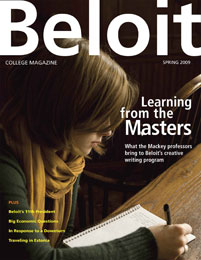
| This magazine cover has a good colour scheme of orage, white and blue, The mast head at the top in bold writing and bigger than all of the other writing shows us that it is the name of the magazine, also the colour makes it stand out from the background and the picture. The picture is infront of the title to draw attention to the picture but at the same time the picture is in black and white making the title stand out more. The cover lines are also in colour making them stand out from the background. There is a sell line and a barcode to make it look like a magazine cover |
Subscribe to:
Comments (Atom)