Monday 18 July 2011

Evaluation

In my evaluation the following questions will be answered in detail:
·         In what ways does your media product use, develop or challenge forms and conventions of real media products?

·         How does your media product represent particular social groups?

·         What kind of media institution might distribute your media product and why?

·         Who would be the audience for your media product?

·         How did you attract/address your audience?

·         What have you learnt about technologies from the process of constructing this product?

·         Looking back at your preliminary task, what do you feel you have learnt in the progression from it to the full product?

In what ways does your media product use, develop or challenge forms and conventions of real media products?
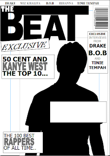
First of all i think that from my front cover i have used existing magazines to get my layout, font and other different parts on it, for example i have used a feature that 'Vibe' magazine use on most of their magazine cover which is the artist's names at the top of the page that will be featured in that edition of the magazine, this makes the magazine look more professional compared to one that doesn't really tell you what is going to be inside. Another thing i have used that you could find on most other music magazines is the way the font changes size and thickness so it is the same size and the text above or below it, an example of this is where it says 'The 100 best rappers of all time' this makes the word 'Rappers' the same size as where it says 'The 100 best' even though one is three words and is longer, this makes the word 'Rappers' more noticeable and helps the magazine stand out as a magazine with that style of music.
I think that my contents page is much different to a lot of other ones this is because of the picture, usually in music magazines the content page is mainly taken up with one or two pictures but in mine it just has one small one which makes the reader focus more on the actual contents of the magazine. One thing i think i have taken from existing media products is the way the word 'Contents' is set out this makes the magazine look more interesting rather that having it just on one line and it also helps the colour scheme look better than it would if the word was just all one colour.
I think that my double page spread has things that are in existing magazines the most noticeable thing being the picture that takes up one of the pages making it better to look at for the reader and also what is in it is the colour scheme is partly made from the hoody of one of the people in the photo's this makes the magazine look more realistic because this is the type of thing you would expect to see in a magazine made by professionals. Another thing taken from existing magazines would be the interview, i chose to do this because it is more interesting to read a interview from the person in the article hearing what they think rather than someone writing about them.
How does your media product represent particular social groups?
I have aimed my music magazine at people between the ages of 13-21 and people who are fans of hip-hop music i have represented the type of people that listen to it as the kind of people who wear hoodies, you can see this because in every picture one of the people in it is wearing a hoodie, which could be seen as a bad representation, this is because the older generation like the link hoodies with crime because of the fact that you can hide your identity using one, whereas people that usually wear them do so because they are comfortable and warm.
What kind of media institution might distribute your media product and why?
The places that i think would distribute my media product are places like newsagents, supermarkets and music shops it would be these places because that is where people are most likely to buy them from and they probably wouldn't be located in the city because people from big cities aren't really known for liking this type of music.
Who would be the audience for your media product?How did you attract/address your audience?
The target audience for my magazine is people from the age of 13 to people at the age of around 21 so it is basically teenagers and people that are fans of hip-hop and rap music i used things like pictures to attract them, for example the style of clothing used in the pictures are the stuff they would wear so they could probably see part of themselves in the picture another thing i chose to do is use names of people they have heard of so if they liked them they would want to read about that person.
What have you learnt about technologies from the process of constructing this product?
I have learned quite a lot about technologies while i have been creating my music magazine one thing i have learned is that it isn't easy to make a magazine, another thing i have learned to do better than i could before i started this is editing images well enough to not have any of the background left, i knew how to use all of the computer programmes before we started so i didn't really learn much about them but with the camera i learned that you couldn't just use any photo because of things like lighting, if it is in the wrong position then it could stop you from seeing the persons face and you could encounter many problems like that.
Looking back at your preliminary task, what do you feel you have learnt in the progression from it to the full product?
Looking back at my preliminary task i think that i have learned to do everything better, things like analyzing pictures, editing photo's and even knowing what way to lay a magazine cover out so it  looks quite professional and even things like making an interview hat people could believe was a real one and just generally looking back at all of the work i have done i can tell that i have learned more and got better at doing this type of work.

Thursday 17 March 2011


This image shows my finished magazine double page spread featuring my edited picture and the magazine website with the interview that i wrote.
 
This is an image of my finished magazine front cover showing an edited picture and all of the titles and the magazine website at the bottom.
 
This image shows my contents page just before i had put my pictures in it.
 
This is an image of the finished version of my front cover with all of the cover lines, the date, a barcode and an image on it.
 
This image shows the my draft cover of the final magazine without any of the sell lines or cover lines filled in, just showing the layout of all of the features.

This draft cover of my magazine shows some of the features, cover lines and the sell line, to show what kind of layout the magzine will have with all of the detail on it.
 

Monday 7 March 2011

Double Page Spreads


This magazine double page spread has a colour scheme, which is red, white and black, it is used throughout the pages and gives the magazine a better look, The font also makes the page look better, on this one the colour makes the white writing stand out more to make it more eye catching. On this article there is 4 different pictures whereas on most other double page spreads there is only one or two pictures.

On this double page spread it shows the article on one side of the page and a image taking up the other side of the page, there is also a colour scheme which is made from the colour on the womans shirt, black red and white. The quote at the top left cathces people attention because of the font and the way it has been layed out and the contrast betweeen the colours. Whereas some double page spreads have more than one image, this one only has one.


This double page spread shows the text at the bottom right and the image on the left hand side, like the other magazine it only has one image but the colour scheme probably comes from the colour of the womans hair. Also the font that stand out the most is where is says "got the love" this is because it is a completely different font to the rest of the page.
 
On this doube page spread it shows two different articles, one on the left page and one on the right, and unlike the other double page spreads the picture carries on nearly being the size of the two pages. there is a colour scheme that is gold black and white, this has came from the clothes that the people in the image are wearing although one of them is standing out more than the rest, which is most likely because the article is about him.


Friday 4 February 2011

Music Magazine Contents Pages


On this contents page from Vibe you can see a picture of two artists who are probably the main story in the issue ans that is why they take up the whole of the page, also to the left of them is the other stories from the issue and their page number and to the top left is the word contents which is layed out different to all other magazines showing that is is Vibe magazine. There is no scolour scheme as it is just black writing on a white beckground which is probably to make you focus on the picture and not the text. The fonts make the title of the page stand out because the font saying whats on the pages has curves and the font saying contents doesnt have any curves.
 
This contents page from the magazine NME has a big picture in the middle of Kasabian with their name as the biggest headline showing the reader that this is the main story in the magazine and it also has a short introduction to why they are the main story. Also on the right side their is the other news and stories in the magzine and their page numbers and the band index is on the left. Another feature on this contents page is the advert to subscribe to the magazine which isnt on other contents pages that i have seen. The contents also has a colour scheme which is black, white and red and it is most likely because these are the colours on the NME part of the magazine.


This contents page from a magazine shows the main person in it as Kanye West it shows this by making him take up most of the page being the only thing that stands out, but the main thing that stands out is the heart being held to him, this is because it it the only thing on the page that is not it black and white, The background also stands out with the V shape this could be the name of the magazine or the magazines initials. This contents page has all of the features on the right side of the page and it has the information about Kanye West next to the picture. Also on this page the way contents is written it isn't all on the same line which is the same with every issue of this magazine.


This contents page from the magazine Q has a picture of a band that has their name, the page number and some text about why their in the magazine. The fact that they are the biggest picture and their name is the biggest shows us that they are the main band in the issue. This contents page also has a good colour scheme which is red black and white. It also uses different fonts and whether the writing is bold or not to highlight different sections of the page, for example the word Contents is bigger and bolder than all of the other words to show what page it is, and where it says Oasis Special it is a different font to the rest of the page. The layout of the the page has all of the stories on the left side of the page and the main story taking up most of the page with a picture on the right, It also has a review at tomorrow and the date in the top right of the page.

Tuesday 1 February 2011

Music Magazine Covers Research


On the cover of this issues of The Source magazine There is a close-up of The Game and it is in front of the title and the only picture on the cover which makes him  the most important thing in that issue, Also the text that says The Game is the biggest and boldest and it is also in a different font which also makes him seem the most important thing in the issue. There is a colour scheme of red and white which probably originates from the name of the magazine as it is red, white and black also the red and black could come from the tatoo's he has. Other things that make the magazine look more professional and real are the bar code and the sell line.

On the cover of this Scratch magazine there is a picture of Lil Wayne that is bigger than the picture of DJ Khaled and it is in front of the name of the magazine which shows us that he is the main attraction in this issue of the magazine followed by DJ Khaled, We can also tell this by the size of the text because it is the biggest apart from the name of the magazine and DJ Khaled's name is the second biggest. There is an obvious colour scheme consisting of yellow, blue and white with the background being almost the same colour as the clothes Lil Wayne is wearing and the blue could come from the colour of the shirt DJ Khaled is wearing. The sell line on the cover of this magazine is just above the name of it which makes it noticeable but only when your are close to the magazine. There is a bar code on this magazine which is located on the bottom left and it doesn't really stand out although it is on top of a picture.


This is a magazine cover from the music magazine cover Vibe where you can see the image that takes up most of the cover and is in front of the name of the magazine this makes the reader know that this person is the main story in this issue of the magazine. the colour scheme comes from what he is wearing, the blue colour on the cover comes from the collar of his top, and then pink colour contrasts with the blue and the other colour is black which contrasts with the grey background and is also the same colour as his hair. This issue of the Vibe magazine does not have a bar code on the front of it, which i have noticed a lot of the new Vibe magazines don't have bar codes on the front of them. The different fonts and sizes of text on this cover shows us what the main cover line is and what are the smaller stories in the magazine, The main thing being Kanye West and other smaller things such as The Battle For J Dilla's Legacy. Other styles of font used on this cover is Italics and whether or not the text is Serif or Sans Serif. There also is no sell line on the cover of this magazine.


The photo in this picture takes up most of the front cover drawing the readers attention to the artist and make them look at the headlines about the artist. The colour scheme is green and black writing with a white background which looks good and draws attention to the parts of the magazine that the creators wanted, the only other colour on the front of the magazine is the sell line which is orange, and this is because it is the line on the cover that is supposed to sell the magazine to the reader.On the front of this magazine there is a bar code which also makes the magazine look professional, some words are is a different font on the front of this magazine than others and some are bigger and bolder, this is because the creator wanted the reader to look at these words such as "Life" and where it says "Plies".


Monday 17 January 2011

Preliminary task

This is my finished school magazine cover


This is the draft for my contents page for my school magazine


This is a professional magazine contents page, that looks good because of the layout colour scheme and the font, the coloyur scheme is pink black and white, the pictures make the cover look like it is professional becasue there isnt too many and there isnt too much.


This contents page is not from a professional magazine, but it does have a clear colour scheme consisting of red, black and white. The way it is layed out looks quite professional and the pictures with the numbers in them also adds to the professional look of the contents page.The font and the titles also make the magazine look better quality and something that has been made by professionals


This is a contents page from an un professional magazine and you can see that it has a colour scheme of black white and yellow, the yellow coloured numbers are the same colour as the lights in the picture at the top making it look more professional, and the colour scheme and font also help the look.

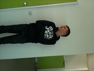
This was the photo i took for the front cover of my school magazine, which i manipulated to remove all of the background and all other things to make it look more professional and make it so i can change the background colour on the magazine.


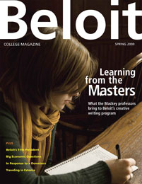
This magazine has a colour scheme of green, pink and white, it looks like a good magazine that you would see in shops, the bright green title makes you focus on that as does the the photograph because it stands out from the bright white background. The cover lines all stand out by being in the colour scheme and most of teh other writing is white.


This cover has a dark theme with white writing making the mast head stand out and the picture look calm and relaxed. It has a good colour scheme which is white yellow and black, the title is the opposite colour from the picture to make it stand out and be noticable. The cover lines dont really stand out making all of the focus on the picture, the mast head and the main cover line. there is no sell line on this magazine making it look more un professional.


This magazine cover has a good colour scheme of orage, white and blue, The mast head at the top in bold writing and bigger than all of the other writing shows us that it is the name of the magazine, also the colour makes it stand out from the background and the picture. The picture is infront of the title to draw attention to the picture but at the same time the picture is in black and white making the title stand out more. The cover lines are also in colour making them stand out from the background. There is a sell line and a barcode to make it look like a magazine cover