Thursday 17 March 2011


This image shows my finished magazine double page spread featuring my edited picture and the magazine website with the interview that i wrote.
 
This is an image of my finished magazine front cover showing an edited picture and all of the titles and the magazine website at the bottom.
 
This image shows my contents page just before i had put my pictures in it.
 
This is an image of the finished version of my front cover with all of the cover lines, the date, a barcode and an image on it.
 
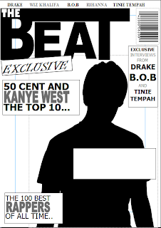
This image shows the my draft cover of the final magazine without any of the sell lines or cover lines filled in, just showing the layout of all of the features.

This draft cover of my magazine shows some of the features, cover lines and the sell line, to show what kind of layout the magzine will have with all of the detail on it.
 

Monday 7 March 2011

Double Page Spreads


This magazine double page spread has a colour scheme, which is red, white and black, it is used throughout the pages and gives the magazine a better look, The font also makes the page look better, on this one the colour makes the white writing stand out more to make it more eye catching. On this article there is 4 different pictures whereas on most other double page spreads there is only one or two pictures.

On this double page spread it shows the article on one side of the page and a image taking up the other side of the page, there is also a colour scheme which is made from the colour on the womans shirt, black red and white. The quote at the top left cathces people attention because of the font and the way it has been layed out and the contrast betweeen the colours. Whereas some double page spreads have more than one image, this one only has one.


This double page spread shows the text at the bottom right and the image on the left hand side, like the other magazine it only has one image but the colour scheme probably comes from the colour of the womans hair. Also the font that stand out the most is where is says "got the love" this is because it is a completely different font to the rest of the page.
 
On this doube page spread it shows two different articles, one on the left page and one on the right, and unlike the other double page spreads the picture carries on nearly being the size of the two pages. there is a colour scheme that is gold black and white, this has came from the clothes that the people in the image are wearing although one of them is standing out more than the rest, which is most likely because the article is about him.